How You Can Edit a Bar Graph Field
The generated bar graph field shown in the following illustration contains three differently shaded rectangle shapes (or three differently shaded lines for the line graph), which represent each of the three possible data sets:
The properties of these rectangles or lines correspond to those of the bars or lines, which represent the data as drawn in the actual graph. These properties are described as follows:
Grid Line Color and Style
The grid line color and style is represented by a segment shape (line),
which is identified by text Grid Line.
Default: solid, gray
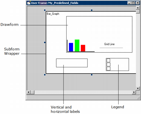
Sizing the Display
The size of the display can be modified by adjusting the size of the drawform subform and its parent subform wrapper. The boxes for the vertical and horizontal labels and the legend may require adjustments depending on the length of the text used in them.
Y-Axis Endpoints and Step Interval
In the Graph Assistant, the Y-Axis box lists the high, step, and low values that correspond to values that will be displayed on the graph. The High and Low values may be adjusted for aesthetic and readability considerations.
Y-Axis Labeling
Lets you configure how the y-axis will be scaled and labeled. The available options are:
Auto Size
Specifies that either Zero Base or High Res is dynamically selected at runtime
Zero base
Specifies that zero (0) appears as one of the y-axis tick labels
High res
Provides the effect of zooming in on the data. Generally, the minimum value on the y-axis is slightly less than the data set minimum rather than being zero.
None
Specifies that no adjustments should be made to the labeling range; the actual maximum and minimum of the selected data is used as the endpoints of the y-axis. (This selection is not recommended for bar graphs whose data is all positive or all negative.)