Table Field Components
A table field is made up of many individual parts, such as its scroll bar, its title, its columns, and its outlines. OpenROAD lets you change many of the characteristics of these parts so that you can customize a table field as needed.
This section describes the parts of a table field, tells you what kinds of changes you can make to each part, and shows you the correct 4GL syntax to reference each part.
In most cases, you must use the field function in your 4GL code to access the properties of a table field (created in OpenROAD Workbench) or its parts. Using the field function accesses the reference variable that points to the TableField object. Referring to the table field without using the field function refers to the array displayed by the table field. For a full description of the field function, see
Working with Arrays, Table Fields, and Collections.
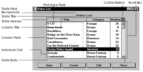
The following application window shows the parts of a table field. These parts are described in the sections that follow.
Table Field Background
The table field background represents the space on the form occupied by the table field. You can change the color and pattern of this space or the width, color, and pattern of its bounding line. To access these attributes, use the following syntax:
field(tablefield).attribute = value
attribute
Specifies any attribute of the TableField object. For example, the following code changes the background of the specified table field to light blue:
field(custtable).bgcolor = CC_PALE_BLUE;
Table Title
You can change the table title's text and appearance, for example, its typeface or the color of its background.
You access the title's text with the Title attribute of the TableField object. This attribute has a data type of varchar(256). The syntax is:
field(tablefield).Title = title_string
title_string
Specifies a quoted literal or a varchar variable
For example, the following statement changes the title of the custtable table field:
field(custtable).title = 'Customer Information';
To change the visual properties of the title, use the TitleTrim attribute, which has a data type of FreeTrim object. The syntax is:
field(tablefield).TitleTrim.attribute = value
attribute
Specifies an attribute of the FreeTrim object
For example, the following statement sets the background color of the table's title:
field(custtable).titletrim.bgcolor = CC_PALE_BLUE;
Table Header
The table header displays the column titles of the table field. OpenROAD lets you display or remove this header and change its appearance and boundary line.
To access the visual characteristics of the table header, use the TableHeader attribute of the TableField object. The data type of this attribute is StackField. The syntax is:
field(tablefield).TableHeader.attribute = value
attribute
Specifies an attribute of the StackField object. For example, the following statement sets the pattern of the table header's bounding line:
field(custtable).tableheader.outlinecolor = CC_PALE_BLUE;
For more information about working with column headers, see
How You Can Display and Remove Column Headers.
Column Titles
You can change a column's title text or its visual appearance. To change the text, use the following syntax:
field(tablefield[*].column).Title = title_string
This syntax references the Title attribute of the column's ColumnField object.
Title = title_string
Data type: varchar(256)
Specifies a title, which can be a quoted literal or a varchar variable
Use the TitleTrim attribute of the ColumnField object to access the visual attributes of the title. TitleTrim is a FreeTrim object. The syntax is:
field(tablefield[*].column).TitleTrim.attribute = value
attribute
Specifies an attribute of the FreeTrim object. For example, the following statement changes the title of the custname column to boldface:
field(custtable[*].custname).TitleTrim.IsBold = TRUE;
Column Field
You can change a variety of a column's visual characteristics. To access these characteristics, use the following syntax:
field(tablefield[*].column).attribute = value
attribute
Specifies an attribute of the ColumnField object. For example, the following statement sets the background pattern of the custname column in the custtable table field:
field(custtable[*].custname).bgpattern=FP_SHADE;
Prototype Field
The prototype field is not an actual physical area on a table field, but rather a template for all the fields in the column. You can access this field in the Frame Editor by choosing the first row of the table field. You can access this template in 4GL through the ProtoField attribute of the ColumnField object. The ProtoField attribute's data type is FormField.
The FormField object is high in the system class hierarchy. Most of its useful attributes are associated with actual field objects, such as entry field or list field, that are subclasses of the FormField object. Therefore, you must cast references to the ProtoField attribute to the appropriate field type. The syntax is:
fieldtype(field(tablefield[*].column).ProtoField).attribute = value
fieldtype
Specifies the class of the column's fields
attribute
Specifies any appropriate attribute of that class.
When you change a ProtoField attribute, the change appears in all the cells in the column. The following statement causes all of the values in the custname column (a column of entry fields in the table field custtable) to appear in boldface:
entryfield(field(custtable[*].custname).protofield)
isbold = TRUE;
You can hide a table field column by setting the bias of its protofield to FB_INVISIBLE:
entryfield(field(tf[*].name).protofield).CurBias = FB_INVISIBLE;
Individual Cells
You can access some of the visual characteristics of individual cells of an unnested table field by using the CellAttribute object. This object has a variety of attributes that control several of the visual characteristics of a cell. Note that because the size of a cell is always identical to the size of all cells in the same column, you cannot change any attributes that would affect the size of a CellAttribute attribute.
The syntax for changing individual cell attributes is:
field(tablefield[n].column).attribute = value
tablefield[n].column.attribute
Identifies a specific cell in row n of the array for the table field, and attribute is an attribute of the CellAttribute object
For example, the following statement changes the background color of the fourth cell in the name column of the custtable table:
field(custtable[4].name).bgcolor = CC_LIGHT_BLUE;
Because of the significant overhead entailed in their use, CellAttribute objects are not automatically created when a table field is created. CellAttributes can be turned on explicitly with the HasCellAttributes property. Or they are turned on implicitly by changing a single cell's attribute. They can be freed up by turning off HasCellAttributes, but this resets all attributes back to the protofield's default attributes.
There are no CellAttribute objects for the cells of nested table fields.
Table Body
The table body represents the set of columns in the table field. To access this part of a table field, use the TableField object's TableBody attribute. This attribute's data type is StackField. You can use this attribute to change visual properties of the table body's line boundary and background. The syntax is:
field(tablefield).TableBody.attribute = value
attribute
Specifies an attribute of the StackField object. For example, the following statement sets the width of the outline of the table:
field(custtable).tablebody.outlinewidth = LW_THIN;
The TableBody attribute is also useful in obtaining information about a table field (such as column names and data types) that is accessed at runtime but unknown at development time.
For a discussion and example of finding which table field a field is in, and then using the TableBody attribute to iterate through the Child Fields, see
WhichTableField Method.
Control Button
By default, each table field has a control button that provides the user with a menu of operations that can be performed on the table field. This menu appears when the user clicks the control button.
You can remove and add this menu. You can also change which operations appear on the menu. For instructions about performing these tasks, see
How You Can Remove or Add the Control Button.
Scroll Bar
The scroll bar lets users scroll up or down in a table field display to bring undisplayed rows in the array into view. A scroll bar is present by default on every table field when it is created.
To scroll horizontally (in a vertical table field), you can put the table field into a view port. A vertical table field can also have its own horizontal scrollbar. If a table field has n columns, and you set the ColumnsDisplayed attribute to a number less than n, only the leftmost columns are displayed. However, if you set the HasHorizontalScrollBar attribute to TRUE, a scrollbar is displayed at the bottom of the table field that lets the user scroll to see all columns.
You can remove the scroll bar from the display or bring it back if it is not displayed. For more information, see
How You Can Display and Remove the Vertical Scroll Bar.
Summary of Table Field Access Syntax
The following table provides a quick reference for the correct syntax to access each part of a table field:

