Components Portlet
OpenROAD applications are made up of components:
The following different component types are available:
• User frames
• Ghost frames
• User classes
• External class libraries
• 4GL procedures
• 3GL procedures
• Database procedures
• Global variables
• Global constants
• Include scripts
• Frame templates
• Field templates
You can use these components to structure your applications however you want.
The Components portlet on the Develop tab displays components of the application selected in the Applications portlet. A right-click context menu provides quick access to the tasks that you can perform on components.
Display Application Components
You can display the components of an application in the Components portlet of the Develop tab.
To display application components
In the Applications portlet, select the application whose components you want to display.
The Components portlet displays a list of all the components in the application.
Refresh the Components List
You can refresh the display of components for a selected application on the Develop tab.
To refresh the component list
Activate the Components portlet and click View, Refresh.
Display Component Versions
You can display all component versions defined in the selected application on the Develop tab.
To display component versions
Activate the Components portlet and click View, Show Component Versions.
The list view is updated accordingly.
Change the Display of Components
You can customize the appearance of Components portlet on the Develop tab using the View menu.
The default display format includes a basic list of component names. You can add additional details, such as developers' remarks, component status, creation statistics, or variable information.
To add additional columns to this display
1. Activate the Components portlet and click View, Columns.
The Select Component Columns dialog appears.
2. Select additional details to be displayed (for example, Creation Date and Type).
Note: The choices you make here affect the list of available search options displayed in the Find Component Property dialog. For more information, see
Find an Application or Component.
3. Click OK.
Additional columns appear in the Components portlet.
Note: Each column header is also a button. Click a column header to sort the list based on that column's contents; click again to switch between ascending and descending order.
You can change the display format to a list view with properties, a simple list view, or icons only.
To display components with a list of their properties
Activate the Components portlet and click View, Properties.
The components display changes to the Properties format.
To display components as icons
Activate the Components portlet and click View, Icon.
All of the application's components are displayed as icons.
Specify Component Types
You can restrict the types of components displayed in the Components portlet of the Develop tab.
To restrict the types of components displayed
1. Click the Filter portlet tab on the left side of the Develop tab.
The Component Filter portlet is displayed.
Note: By default, all component types are selected.
2. Click Clear All.
All components are cleared.
3. Select the component type or types you want to display. For example, select only the UserFrame option.
4. Click OK.
The Components portlet now displays only the component types you selected.
Display Component Relationships
You can display component relationships in the Components portlet of the Develop tab using the View menu. You can select the following types of component cross‑reference options:
References
Displays all the components on which the specified component depends. For example, if the selected component is a class, its superclasses are displayed and all other components to which it refers—user frames, global variables, constants, and so on.
Referenced By
Displays all components that refer to the specified component. For example, if the selected component is a global variable, all components that refer to it are displayed.
Generated From
Indicates whether the specified frame, or one of its fields, was generated from a frame or field template
Default: References
Note: Cross-reference information is available only for compiled applications in the database repository, not for application images.
Being able to cross-reference components in large applications is important because it lets you know at a glance whether a particular component depends on any other. For example, if you are considering changing the data type of a global variable, you can easily find the components that depend on it and make any necessary code adjustments.
To view the cross-references
1. Click a user frame component in the Components portlet.
2. Click View, Cross Reference.
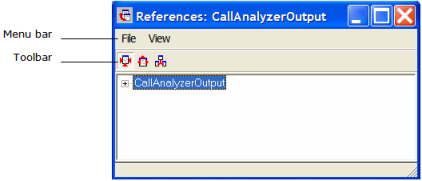
The References window appears:
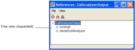
3. Click the + icon to the left of the top level component.
4. The root component expands in a tree structure:
If the user frame contains other components, + icons appear next to them, indicating that these branches in the tree can also be expanded.
5. Select one of the components in the hierarchy and then do one of the following:
• Click View, Referenced By
The References window changes, showing which component calls that user frame.
• Click View, Generated From
The References window shows all components that use the selected component.
6. Click File, Close.
The References dialog closes.


