Create a Tab Folder
A tab folder field is used to present data or a series of choices in a multiple-page format. By default, it consists of three blank tab pages that resemble file folders. When the end user clicks one of the tabs on the tab bar, the corresponding page moves to the foreground and enables access to its data and fields.
This particular type of field lets you design forms that conserve space and present data more efficiently to the end user.
To create a tab folder
2. Select the Tab Folder icon on the field palette.
3. Position and size the tab folder field on the form.
4. Specify the tab folder properties:
a. In the Property Inspector for the tab folder field, click the TabPageArray property.
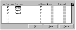
The Tab Page Array dialog appears:
b. Replace the default text label, Page1, with the name of your first tab.
c. Tab to the other text labels, and replace the default text with your labels.
d. Specify any other settings for your tabs.
e. Click OK.
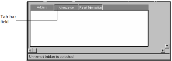
5. Specify Tab bar properties by clicking the tab bar field.
The Property Inspector changes focus from the tab folder field to the tab bar field. A tab folder consists of tab page fields and a tab bar field, as well as the tab folder field:
6. Set the SelectedIsBold property to TRUE in the Property Inspector.
7. (Optional) Specify other properties, such as DisplayBitmap, MultiTabStyle, OutlineColor, TabBgColor, and TabShape, for the tab bar field.
8. Specify Tab page properties by clicking the Name Tab.
This lets you access the tab's corresponding tab page field:
9. Change the BgColor property to the color of your choice.
10. Add fields to this page, using the same method you used to add fields to the frame.
Note: A wizard is one example of the kind of frame that you can create using the tab folder. A wizard typically provides a sequence of pages; each page represents a step in a process and prompts the user to enter data or make decisions. The user proceeds to the next step, backs up to a previous step, or cancels the entire process. A Finish button on the last page of the wizard lets the user complete the process and commit the transaction.
Tab Folder Properties
All the properties for tab folders and their corresponding tab page and tab bar fields, are described in
Common Field Properties, with the exception of the following properties that are specific to the tab folder field type.
Tab Folder Field
CurPageIndex
Indicates the index of the currently mapped tab page
Note: You can optionally change this value, which causes the current page to be unmapped and a new page to be mapped. It does not, however, cause any 4GL events to be generated. For more information, see the TabFolder class topic in the Language Reference Guide.
IsShadowed
Specifies whether the tab folder shadows match those of its associated tab bar. Possible values are:
TRUE
Specifies that the tab folder shadows match the tab bar
FALSE
Specifies that the tab folder shadows do not match the tab bar
Default: TRUE
TabPageArray
Specifies the array containing all the tab pages in the tab folder. Only one tab page is displayed at a time. You can optionally insert new tab pages, or delete or modify any existing ones using this attribute.
Tab Page Field
DelayMkwidget
Specifies when the tab page is constructed. Possible values are:
TRUE
Specifies that the tab page is not actually constructed until it is displayed. (This may improve performance.)
FALSE
Specifies that the tab page is constructed at the time the tab folder is first displayed
Default: TRUE
For more information, see the TabPage class topic in the Language Reference Guide.
Tab Bar Field
BitmapPosition
Specifies which side of the tab the bitmap label is placed on. Valid options are:
POS_TOP
POS_LEFT
POS_BOTTOM
POS_RIGHT
POS_CENTER
Default: POS_LEFT
Note: The DisplayBitmap property must be set to TRUE for this property to have effect.
DisplayBitmap
Specifies whether a bitmap label is to be displayed on the tab. Possible values are:
TRUE
Displays a bitmap label
FALSE
Displays no bitmap label
Default: FALSE
DisplayText
Specifies whether a text label is to be displayed on the tab. Possible values are:
TRUE
Specifies a text label
FALSE
Specifies no text label
Default: TRUE
IsFixedWidth
Specifies whether all tabs are of equal width. Possible values are:
TRUE
Specifies tabs are of equal width
FALSE
Specifies that tabs may be of different widths
Default: TRUE
MultiTabStyle
Specifies what style to use if there are too many tabs to fit in the tab bar's display area. Valid options are:
TAB_SCROLL
Specifies that the tab bar scrolls to display additional tabs
TAB_OVERLAP
Specifies that the tab bar overlaps additional tabs
Default: TAB_SCROLL
NormalTabColor
Specifies the color of an unselected, or normal, tab
Default: CC_PALE_GRAY
NormalTextColor
Specifies the text color for an unselected tab
Default: CC_BLACK
SelectedIsBold
Specifies whether the text label of the selected tab is displayed in boldface. Possible values are:
TRUE
Specifies that the text label is displayed in boldface
FALSE
Specifies that the text label is not displayed in boldface
Default: FALSE
SelectedIsItalic
Specifies whether the text label of the selected tab is displayed in italics. Possible values are:
TRUE
Specifies italics for the text label
FALSE
Does not specify italics for the text label
Default: FALSE
SelectedIsPlain
Specifies whether the text label of the selected tab is plain, that is, neither bolded nor italicized. Possible values are:
TRUE
Specifies that the text label is plain
FALSE
Does not specify that the text label is plain
Default: TRUE
SelectedTabColor
Specifies the color of a selected tab
Default: CC_PALE_GRAY
SelectedTextColor
Specifies the text color for a selected tab
Default: CC_BLACK
SelectedTypeFace
Specifies the type face of the text on a selected tab. Valid options are:
TF_SYSTEM (system font)
TF_COURIER
TF_HELVETICA
TF_LUCIDA
TF_NEWCENTURY
TF_TIMESROMAN
Default: TF_SYSTEM
SelectedTypeSize
Sets the point size of the text for a selected tab. Valid options are:
8, 10, 12, 14, 18, or 24.
Default: 8
Separation
Specifies the number of pixels separating a text label from a bitmap label
Default: 3
ShadowColor
Specifies the color for a tab's shadow
Default: CC_SYS_BTNSHADOW
TabBgColor
Lets you select a color from a color palette for the tab bar's background
Default: CC_PALE_GRAY
TabGap
Specifies the number of pixels separating tabs, that is, the size of the tab gap
Default: 0
TabJustification
Specifies on which side of the tab bar the tabs are justified. Valid options are:
JU_LEFTORTOP
Specifies that tabs are left justified
JU_RIGHTORBOTTOM
Specifies that tabs are right justified
Default: JU_LEFTORTOP
TabShape
Specifies the shape of the tab. Valid options are:
COR_ROUNDED
Specifies tabs with rounded corners
COR_SQUARE
Specifies tabs with squared corners
COR_ANGLED
Specifies tabs with slightly angled corners
COR_SLOPED
Specifies tabs with steeply angled corners
COR_BITMAPPED
Specifies tabs whose appearance is defined by their TabField NormalBitmap and SelectedBitmap properties
Default: COR_ROUNDED
XMargin
Specifies the horizontal margin between the outside of the tab and the label in pixels
Default: 2
YMargin
Specifies the vertical margin between the outside of the tab and the label in pixels
Default: 2
Create Bitmapped Tabs
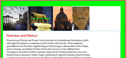
You can create tab folders using bitmapped images to make a wide variety of appearances. Here are some examples:
To create bitmapped tabs, you must provide a NormalBitmap and a SelectedBitmap for each tab. These images can be the same or different. The width of each bitmap should accommodate the text label of that tab. For the "tail" effect in the first example, you will need a suitable BgBitmap for the tab bar itself.
To create a bitmapped tab
3. Specify the tab folder properties:
a. In the Property Inspector, set the OutlineStyle to OS_SOLID or OS_3D.
b. Set the OutlineWidth to LW_NOLINE.
c. Click the TabPageArray property.
The Tab Page Array dialog appears:
d. Edit the text labels as desired.
e. Check the Has Bitmap setting for each tab page.
f. Check each Normal bitmap placeholder and navigate using the file dialog to select the NormalBitmap that you want for that tab.
g. Check each Selected bitmap placeholder and navigate using the file dialog to select the SelectedBitmap that you want for that tab.
h. Click OK.
i. Create a tab folder and examine its TabPageArray in the Property Inspector as described previously.
4. Specify the tab bar properties by clicking the tab bar field:
a. Set the TabShape to COR_BITMAPPED.
b. Set the BitmapPosition to POS_CENTER.
5. Check the result in the editor by selecting different tabs and examining the visual effect.


