Tree Views
A tree view field presents the end user with a hierarchical list of items in a tree structure that can be expanded or collapsed. Each item in the tree view consists of a label with an optional icon, and each item may also have an associated list of subitems.
The contents of the tree view can be displayed with buttons that expand and collapse subitems and with lines that link subitems to their parent items. Other end user options include highlighting the selected item in the tree view and editing item labels.
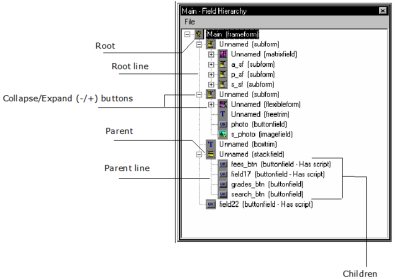
An example of a tree view field is OpenROAD's Field Tree window, discussed in Field Tree. For example, the following Field Tree window displays the hierarchy of the fields in the Main frame of the SIS sample application:

Each item has a text label and an associated icon. Also, each branch of the tree can be expanded or collapsed, as indicated by the + and - buttons to the left of the icons, including the root of the tree, Main.
Note: The contents of a tree view are defined programmatically. Even though you can place a tree view field on your form and specify its properties, you cannot define its contents using the Frame Editor. Therefore, it initially appears empty. For more information about tree view fields, see the chapter "Working with List Views and Tree Views" in the Programming Guide.
Create a Tree View
You can create a tree view on your form.
To add a tree view field to your form
1. Open your frame in the Frame Editor (see Open an Existing Frame).
2. Select the Tree View icon on the field palette.

3. Place the tree view field on the form.
4. Set the properties for the tree view field, including AllowLabelEdit, HasButtons, HasLines, and HasRootLine.
As stated previously, the tree view initially appears empty even if you set HasButtons, HasLines, and HasRootLine to TRUE because the contents of the tree view must be defined programmatically.
Note: For complete descriptions of each field property, see Tree View Properties and Common Field Properties. Additionally, see the Tree, TreeNode, and TreeViewField class topics in the Language Reference Guide.
Tree View Properties
All the properties for tree views are described under Common Field Properties, with the exception of the following properties that are specific to the Tree View field type:
AllowLabelEdit
Specifies whether the end user may edit the text labels for items in the tree view. Possible values are:
TRUE
Specifies that the items are editable
FALSE
Specifies that the items are not editable
Default: FALSE
HasButtons
Specifies whether Expand/Collapse (+/-) buttons are placed to the left of a parent item so that the end user can click the button to expand or collapse its subitems. This provides the user with an alternative to double-clicking an item. Possible values are:
TRUE
Specifies Expand/Collapse buttons
FALSE
Specifies no Expand/Collapse buttons
Default: TRUE
Note: The HasButtons property by itself does not add buttons at the root level of the hierarchy. To do so, you must set all three properties—HasButtons, HasLines, and HasRootLine—to TRUE.
HasLines
Specifies that lines are drawn that link subitems to their parent items in the tree hierarchy. Possible values are:
TRUE
Specifies that lines are drawn
FALSE
Specifies no lines
Default: TRUE
HasRootLine
Specifies whether lines are drawn, linking parent items to the root item. A root item is a top-level item in a hierarchical tree structure that has no parent. Possible values are:
TRUE
Specifies that lines are drawn
FALSE
Specifies no lines
Default: TRUE
ShowSelection
Specifies whether an item in a tree view remains highlighted when you tab to another field. Valid settings are:
TRUE
Specifies that the highlighted or selected text remains highlighted when you tab to another field. Any item in the tree view stays marked (until you move to another record in a database or close the window).
FALSE
Removes highlighting when an item in a tree view loses focus (for example, if you tab to another field). When the tree view regains focus, the previous selection will not be highlighted.
Default: TRUE
Last modified date: 12/20/2023