List Views
A list view field lets the end user view and optionally manipulate or edit a list of items. The contents of the list view can be displayed in one of four display formats, or styles:
List
A simple list view
Details
A detailed list view
Icons
A list view with full-sized (large) icons
Small icons
A list view with reduced size (small) icons
An example of a list view field is the Connection Profiles portlet on the Connect tab of OpenROAD Workbench, shown here in Details style:

Note: For more information about dynamic creation of list view fields, see the Programming Guide.
Create a List View
You can create a list view on a form.
To create a list view
1. Open your frame in the Frame Editor (see Open an Existing Frame).
2. Select the List View icon on the field palette.

3. Place the list view field on the form.
4. Accept the default value of TRUE for the HasColumnHeaders property in the Property Inspector and the default value of LVFS_DETAIL for the Style property.
Note: For complete descriptions of each field property, see List View Properties and Common Field Properties.
5. Select the ColAttributes property.
The Column Attributes dialog appears:

6. Click in the Width column of the first item and change the column width (for example, 1000).
7. Tab to the next column, Header Text, and replace the default text, Column 1, with text of your choice (for example, Gender).
8. Repeat Steps 6 and 7, replacing the default text with your values for as many columns as you want for the field.
Note: To add a column, tab to the Width column in the first empty row and enter a value. This action in effect changes the number of columns in your list view.
9. Set the Text Alignment of all the columns using the drop-down menus.
Note: The first column in a list view must be left-aligned.
10. Click OK.
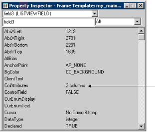
The ColAttributes property indicates the number of columns in your list view:

11. Select the ValueList property to specify the items for the first column only using the Value List dialog. (For example, you might want to specify "males" and "females" for the Gender column.)
Note: For more information about using the ValueList property to define a choice list for the list view, see Add and Delete List Field Items. Also, for more information about populating the other columns in a list view, see the chapter "Working with List Views and Tree Views" in the Programming Guide.
List View Properties
All the properties for list views are described under Common Field Properties, with the exception of the following properties that are specific to the list view field type:
ColAttributes
Specifies the number of columns, their width, and the alignment of text using the Column Attributes dialog
Default: 2 columns
Note: You can also specify the corresponding column headers using the same dialog, if HasColumnHeaders is set to TRUE.
DragItem
Specifies whether the end user may use the drag-and-drop method for manipulating items in the list view. Possible values are:
TRUE
Specifies that the end user may use drag-and-drop
FALSE
Specifies that the end user may not use drag-and-drop
Default: FALSE
Note: This property is available only when the Style property is set to LVFS_ICON or LVFS_SMALLICON.
EditLabel
Specifies whether the end user may edit the text labels. Possible values are:
TRUE
Specifies that the end user may edit text labels
FALSE
Specifies that the end user may not edit text labels
Default: FALSE
FullRowSelect
Specifies how a user can select a row in a listview field. Valid values are:
TRUE
Specifies that the user can select a row in the ListviewField by clicking anywhere on the row; the entire selected row is highlighted
FALSE
Specifies that the user must click an item in the first column to select a row; only the item in the first column is highlighted.
Default: FALSE
HasColumnHeaders
Specifies whether you must specify a column heading for each column in the list view. Possible values are:
TRUE
Specifies that you must specify a column heading for each column
FALSE
Specifies that the list view has no column headings
Default: TRUE
LargeImageHeight
Specifies the height of the images used for the full-sized icons when the Style property is set to LVFS_ICON
Default: 32 pixels
LargeImageWidth
Specifies the width of the images used for the full-sized icons when the Style property is set to LVFS_ICON
Default: 32 pixels
SmallImageHeight
Specifies the height of the images used for the small icons used when the Style property is set to LVFS_SMALLICON
Default: 16 pixels
SmallImageWidth
Specifies the width of the images used for the small icons used when the Style property is set to LVFS_SMALLICON
Default: 16 pixels
Style
Specifies the list view display format, or style. Valid options are:
LVFS_DETAIL
Displays items as a list with detailed information
LVFS_LIST
Displays items as a simple list
LVFS_ICON
Displays items as full-sized (large) icons with text labels below. See related properties, LargeImageHeight and LargeImageWidth.
LVFS_SMALLICON
Displays items as small icons with text labels below. See related properties, SmallImageHeight and SmallImageWidth.
Default: LVFS_DETAIL
Last modified date: 12/18/2025