Set Frame Properties
After creating a new frame, you can use the Property Inspector to set its properties. These settings affect how the frame looks and behaves and also impacts how fields look and behave when placed on the frame.
Frame properties include things such as the frame's title, return value, associated icon, and whether the frame is resizable. The following procedure describes the basic steps to set frame properties. The sections following describe the properties that you can set for a frame—the more complex properties are then discussed in greater detail.
Sometimes you need to set complex combinations of properties in the frame you are editing. The SetupName property enables you to do this.
To set individual properties of a frame
The Property Inspector for the frame appears.
2. Scroll through the Property Inspector's list of properties to locate the property you want to change.
3. Set the value of the property.
4. Click File, Save on the Frame Editor's floating menu bar to save the frame when you are finished setting properties.
Available Properties
The following properties are common to the Frame Editor and the Frame Template Editor, which is discussed in
Alternative Methods for Creating Frames. For more information on property prefixes, see
Property Setting Prefixes.
BgBitmap
Specifies the graphic image to be used for the form's background, if set to Bitmap
Default: No Bitmap
BgColor
Specifies a color from a color palette for the form's background
Default: CC_PALE_GRAY
BgPattern
Specifies a background pattern for the form. Valid options include:
FP_BITMAP*
FP_BITMAPCLEAR*
FP_CLEAR
FP_CROSSHATCH
FP_DARKSHADE
FP_HORIZONTAL
FP_LIGHTSHADE
FP_SHADE
FP_SOLID
FP_VERTICAL
FP_DEFAULT
Default: FP_DEFAULT
Note: *If you set this property to FP_BITMAP, you also must set the BgBitmap property to a valid bitmap image. If the file is a transparent bitmap, set this property to FP_BITMAPCLEAR.
CurMode
Specifies a frame mode for the current frame. Valid options include:
FM_UPDATE
FM_QUERY
FM_READ
FM_USER1
FM_USER2
FM_USER3
Default: FM_UPDATE
For definitions of each of these options, see
Frame Modes.
DataType
Specifies the data type for the value returned to any frame that calls this frame
Default: the data type specified when the frame was created
HasScrollbars
Specifies whether the running frame is displayed with scroll bars. Possible values are:
TRUE
Displays scroll bars
FALSE
Does not display scroll bars
Default: FALSE
IsAutoSized
Specifies whether the initial size of the running frame is just large enough to display all the fields on the form. Possible values are:
TRUE
Auto-sizes the frame
Note: If IsAutoSized is set to TRUE, OpenROAD ignores any values specified for WindowWidth and WindowHeight.
FALSE
Does not auto-size the frame
Default: FALSE
IsBordered
Specifies whether the running frame is displayed with a thick border. Possible values are:
TRUE
Displays the running frame with a thick border
FALSE
Does not display the running frame with a border
Default: TRUE
Note: The IsBordered, IsClosable, IsMaximizable, IsMinimizable, IsPopup, IsResizeable, IsTitled, and IsToolWindow properties are somewhat interdependent; however, not all combinations are possible. For more information, see the Language Reference Guide.

IsClosable
Specifies whether the running frame can be closed using a standard Close button in the upper right corner of the frame. Possible values are:
TRUE
Specifies that the standard Close button is used
FALSE
Specifies that the Close button is not used
Default: TRUE

IsMaximizable
Specifies whether the running frame can be maximized to full-screen size using a standard Maximize button in the upper right corner of the frame. Possible values are:
TRUE
Specifies that the Maximize button is used
FALSE
Specifies that the Maximize button is not used
Default: TRUE
IsMaximized
Specifies the initial state that a frame should be instantiated in at runtime. Possible values are:
TRUE
Specifies that the frame should be displayed as maximized
FALSE
Specifies that the frame should be displayed as not maximized
Default: FALSE
If you set this value to TRUE, when the frame is run, it starts up maximized.

IsMinimizable
Specifies whether the running frame can be minimized to an icon using a standard Minimize button in the upper right corner of the frame. Possible values are:
TRUE
Specifies that the Minimize button is used
FALSE
Specifies that the Minimize button is not used
Default: TRUE
IsNullable
Specifies that the return value can have a null value
Default: FALSE
IsPopup
Specifies whether the frame is treated as a pop-up frame when called. Pop-up frames are frames that remain on top of the calling frame as long as the pop-up is active. Whether the pop-up frame physically blocks the calling frame depends on the window placement setting you specify.
Note: Pop-up frames do not provide a way to minimize or maximize their windows.
Possible values are:
TRUE
Specifies that the frame is a pop-up
FALSE
Specifies that the frame is not a pop-up
Default: FALSE
IsResizeable
Specifies whether the user can resize the frame by dragging one of its borders. Possible values are:
TRUE
Specifies that the user can resize the frame
FALSE
Specifies that the user cannot resize the frame
Default: FALSE
IsTitled
Specifies whether the frame has a title bar. Possible values are:
TRUE
Specifies that the frame has a title bar
FALSE
Specifies that the frame has no title bar
Default: TRUE
IsToolWindow
Indicates whether the title bar has the tool window style. The height of the title bar is slightly shorter than a normal title bar. Only a standard Close button—no Minimize and Maximize buttons—are displayed in the title bar when a frame has this style. Valid options include the following:
TRUE
Specifies that the title bar follows the tool window style
FALSE
Specifies that the title bar does not follow the tool window style
Default: FALSE
Note: This property has effect only if the IsTitled property is set to TRUE.
IsTopMost
Specifies whether the frame is to remain on top of all other running frames. Possible values are:
TRUE
Specifies that the frame remains on top
FALSE
Specifies that the frame need not remain on top
Default: FALSE
StatusText
Defines the text that appears in the frame's status bar
SetupName
Specifies the name of the setup frame to apply to customize frame properties and behaviors that cannot be set using the standard Property Inspector and frame toolbar options.
When the SetupName is changed, the setup frame with that name will be called, and will be passed the frame source of the frame you are editing. When the setup frame is executed, any changes that it makes to your edited frame will be saved when you save the frame.
Note: A setup frame is quite different from a frame that a FrameTemplate assistant procedure might call:
• It is directly invoked from the Frame Editor on an already existing frame, rather than through the frame creation dialog and the assistant procedure.
• It can be in an included application, unlike assistant frames.
• It is omitted from imaged applications unless the -l flag is applied during imaging, unlike assistant frames, which are always present.
• It can be applied usefully at any time in the development lifetime of the target frame, unlike assistant frames, which are almost always applied once when the frame is created.
• Multiple different setup frames can be applied to the same target frame to cumulate a set of changes, unlike assistant frames.
TemplateName
Specifies the name of the frame template specified earlier when creating the user frame (or frame template).
When the FrameTemplate name is changed, the stylesheet associated with that frame template will be copied to the frame you are editing and applied to its fields. It will be saved when you save the frame you are editing.
VersShortRemarks
Specifies a comment about the frame. The comment appears in the Components portlet. If you specified a remark earlier when creating the frame, it is already displayed. You can edit the comment here.
WindowHeight
Indicates the height of the initial window for the running frame, measured in 1000ths of an inch
WindowIcon
Specifies the graphic image that is displayed when the frame is minimized, if set to Bitmap. You can use the default OpenROAD icon or specify an image file containing a custom icon.
Default: No Bitmap
Note: Although bitmap (.bmp) files may work in some cases, we recommend icon (.ico) files.
WindowPlacement
Indicates where to place the window when the frame is first displayed. Valid options include:
WP_INTERACTIVE
WP_FLOATING
WP_PARENTCENTERED
WP_PARENTRELATIVE
WP_SCREENCENTERED (see WindowXLeft and WindowYTop properties)
WP_SCREENRELATIVE
WP_PRIMARYSCREENCENTERED
WP_PRIMARYSCREENRELATIVE
WP_VIRTUALSCREENCENTERED
WP_VIRTUALSCREENRELATIVE
Default: WP_PARENTCENTERED
WindowTitle
Defines the text that appears in the title bar of the running frame's window
WindowWidth
Indicates the width of the initial window for the running frame, measured in 1000ths of an inch
WindowXLeft
Specifies the frame's x coordinate relative to the upper left corner of the screen only if the WindowPlacement property is set to WP_SCREENCENTERED
Default: 0
WindowYTop
Specifies the frame's y coordinate relative to the top of the screen only if the WindowPlacement property is set to WP_SCREENCENTERED
Default: 0
Set a Return Value
A frame’s DataType attribute, or property, is the data type of its return value. You can set a return value in the Property Inspector.
To set a return value for a frame
2. Click the DataType property in the Property Inspector.
The Data Type dialog appears.
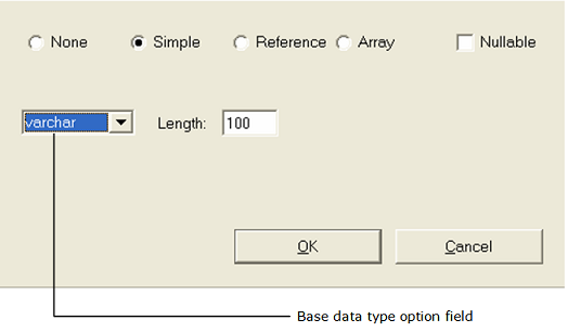
3. Specify the data type for the value returned to any frame that calls this frame:
• None
• Simple
– Varchar
– Smallint
– Integer
– Decimal
– Float
– Money
– Date
– Nvarchar
• Array
• Reference
4. For a Simple type: Select a base data type from the option field and specify its corresponding length, if applicable, in the Length entry field:
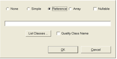
5. For a Reference or Array type: The Data Type dialog changes slightly:
Enter an OpenROAD system class or user class in the empty field in one of the following ways:
• Type in the class name and skip to Step 6.
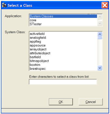
• Click the List Classes button.
The Select a Class dialog appears.
a. Select an application in the Application list.
The Class list displays system or user classes.
b. Select a class from the list.
Note: You can jump to a place in the list by typing one or more beginning characters in the empty field.
c. (Optional) Select Qualify Userclass Name if you want to qualify a selected user class with its application name as a prefix, for example, My_Application!My_User_Class.
d. Click OK.
The Select a Class dialog closes, and the class name field on the Data Type dialog is populated with the class you selected.
6. (Optional) Specify whether the return value can have a null value by selecting the Nullable option.
7. Click OK.
You are returned to the Property Inspector.
8. Save the frame using one of the options on the File menu.
Frame Modes
OpenROAD provides the following frame modes for you to customize for your application:
• Update (default)
• Query
• Read
• User1
• User2
• User3
You can customize the biases for these frame modes to define six different frame behavior modes. For more information about each of these modes, see the Programming Guide.
When the application sets the frame to a specific mode, OpenROAD automatically sets the initial biases for each field and menu item associated with the frame to the ones specified for that mode. A field's bias determines whether the field is visible and how the user can interact with it.
This is important in a multipurpose application that uses a single frame for more than one task. For example, some users may update customer or sales information in a financial application, while others may be allowed only to examine customer and sales data. In such cases, you can use frame modes to change the bias for several or all fields simultaneously.
Whenever you create a frame, Workbench uses the Update mode as the default mode.
For more information about the frame modes, the CurMode attribute of the FrameExec class used to change the frame mode at runtime, or using frame modes and field biases in your 4GL code, see the Programming Guide.
Frame Positioning Settings
The WindowPlacement property determines where a frame appears on the screen when it is called.
The available placement options are described as follows:
WP_FLOATING
Specifies that the system selects a position for the window that is out of the way of the calling frame's window
WP_PARENTCENTERED
Specifies that the window is centered in the calling frame's window
WP_PARENTRELATIVE
Specifies that the window is positioned according to the settings you specify for the WindowXLeft and WindowYTop properties; the position is measured from the upper left corner of the window of the calling frame, in 1000ths of an inch.
WP_SCREENCENTERED
Specifies that the window is centered in the middle of the screen. By default this is equivalent to WP_PRIMARYSCREENCENTERED unless environment variable II_W4GL_USE_VIRTUAL_SCREEN is set to TRUE, in that case this value is equivalent to WP_VIRTUALSCREENCENTERED.
WP_SCREENRELATIVE
Specifies that the window is positioned according to the settings you specify for the WindowXLeft and WindowYTop properties; the position is measured from the upper left corner of the screen, in 1000ths of an inch.
WP_PRIMARYSCREENCENTERED
Centers the window on the primary monitor
WP_PRIMARYSCREENRELATIVE
Positions the window relative to the upper left corner of the primary monitor, using the WindowXLeft and WindowYTop attributes as coordinates
WP_VIRTUALSCREENCENTERED
Centers the window on the virtual monitor
WP_VIRTUALSCREENRELATIVE
Positions the window relative to the upper left corner of the virtual monitor, using the WindowXLeft and WindowYTop attributes as coordinates
Default: WP_PARENTCENTERED
More information:
How You Can Set the Background of a Form
For each frame you create, you can specify the background pattern—solid, cross-hatch, horizontal lines, bitmap, and so on—and the background color for the entire form.
Specify Background Pattern
You can set the background pattern for a user frame using the BgPattern property.
To specify a background pattern
1. Click the BgPattern property in the Property Inspector.
The property's corresponding option field becomes accessible.
2. Select a pattern option from the property drop-down menu.
If you selected FP_CROSSHATCH, your frame would look something like this:
3. Save your frame.
Set Background Color
You can modify the background color of a user frame using the BgColor property.
To set the background color of a user frame
1. Select the BgColor property in the Property Inspector.
A miniature version of the Frame Editor's color palette appears.
Alternatively, click View, Color Palette to access the Frame Editor's primary color palette.
Note: Depending on your operating system and monitor, you can actually select from four color palettes: OpenROAD, System, User, or RGB (Red, Green, Blue). For more information, see
OpenROAD Color Palettes.
2. Select a color from one of the palettes.
The background color of the user frame changes accordingly.
3. Save the frame.
Use an Opaque or Transparent Bitmap for the Background
You can apply a background graphic to a frame using the BgBitmap and BgPattern properties.
To use a bitmap for the background of your frame
1. Select the BgBitmap property in the Property Inspector.
A Browse dialog appears.
2. Click its Browse button.
A standard File Selection dialog appears.
3. Locate and select a graphic file.
The graphic is displayed in the Browse dialog.
4. Click OK.
The value cell for BgBitmap now displays a value of <Bitmap>, but the user frame is unchanged.
5. Click the BgPattern property and replace FP_DEFAULT with FP_BITMAP.
Note: If the file is a transparent bitmap, set BgPattern to FP_BITMAPCLEAR.
Your user frame changes its background display to the selected bitmap.
Select a Color for Transparency
You can choose a color for a frame that, when used, is transparent.
To set a color for transparency
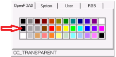
1. Select the TransparentColor property in the Property Inspector.
A miniature version of the Frame Editor's color palette appears.
2. Select the CC_TRANSPARENT color from the OpenROAD palette:
The background color of the user frame changes accordingly. When the frame is run, it will display as transparent.
3. Save the frame.
OpenROAD Color Palettes
Depending on your window system and monitor, you can select from four different palettes when you set the colors for a form or a field:
User
Lets you select the pale, light, or “true” version of 10 different colors plus black and white
System
Lets you apply colors specified by system-defined color constants that represent various screen elements
OpenROAD
Lets you apply the OpenROAD default color mappings defined in a color table for various form elements.
RGB
Lets you set RGB values for the color attribute, which makes it possible to define a full spectrum of custom colors
Style Sheets
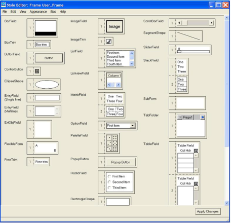
Every OpenROAD frame and frame template has a style sheet. A style sheet defines the appearance of each type of field that can appear on any frame using that template. A style sheet lets you specify certain style attributes for each type of field that you can create for that frame or frame template. These style attributes include visual characteristics such as background color, font, outline width, and bias settings for the field.
A style sheet contains at least one style, or model, for each type of field, and may contain up to eight styles for a field type. The first model of each field, Field Style 1, is used as a default field style. When you create a field on a form, it assumes the visual characteristics of its field style.
When you create a frame, you must specify a frame template on which the frame is based. A frame based on a frame template initially obtains its style sheet from the template. Like frame templates discussed in this chapter, style sheets enable you to develop consistent frame styles and behaviors in your application.
Create or Modify a Style
You can use the Style Editor to create a field style or modify a style sheet. The Style Editor is accessible from the Frame Editor or the Frame Template Editor.
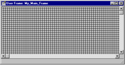
For example, you could specify that every button on My_Main_Frame be pale gray, with red text in 8-point bold System font. This example will be used in the following procedure.
To modify a style
2. Select the button on the frame.
3. Click Tools, Style Sheet on the Frame Editor menu bar.
The Style Editor appears, displaying the style sheet associated with the current frame.
The Style Editor has its own menu bar, and horizontal and vertical scroll bars, so that you can access all of the model fields on the style sheet. It also has an Apply Changes button.
4. Click the model for the type of field you want to modify (for example, ButtonField).
5. Click View, Font Palette.
The default settings are System, Bold, and 8 points.
6. Change the font settings to what you want.
7. Click View, Color Palette.
A color palette appears, similar to that of the Frame Editor. By default, the Background button is selected.
8. Change the color of the element's background to what you want.
9. Click Foreground and then change the foreground (text) color to what you want.
Your selection is reflected in the sample box.
10. Click Apply.
11. Click Close to close the color palette.
Your changes are reflected in the Style Editor.
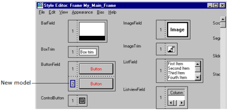
Create Multiple Styles for a Field Type
If you need more than one style for a field type, you can create additional field styles on the style sheet. You can then base fields of the same type on different styles without having to modify the fields individually.
To define a second style for a field type
1. Select the field type in the Style Editor for which you want to add a new style.
2. Click Edit, Create New Field Style.
The style sheet changes slightly. For example:
3. Click the new model to define a unique field style for it.
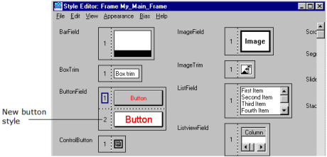
4. Click View, Fonts Palette, and set the font characteristics you want.
5. Set any color options by clicking View, Color Palette.
6. Set any other options on the Appearance menu.
7. Set any bias modes using the Bias menu options.
8. Click Apply Changes.
When you apply the changes you have made, all your field style selections are reflected in the Style Editor. For example:
Note: When you modify a field style, the changes are automatically applied to all fields on the form that are based on that field style. However, you can override the style sheet to apply a different style to an individual field; for more information, see
Creating and Using Basic Fields.
9. Save the user frame.
Note: A style sheet is part of a specific frame, rather than being an application component. However, you can use a particular frame's style sheet with other frames. For more information, see
Use a Frame Style with Other Frames.
Use a Frame Style with Other Frames
Each OpenROAD frame or frame template is associated with its own style sheet. However, you can share style sheets between frames in two ways:
• Save a frame's style sheet as a frame template or file
After saving it as a template or file, you can apply it to other frames.
• Apply a frame template style sheet to shared frames
For instructions, see the appropriate procedure, following.
To save a style sheet as a frame template
1. Open the frame containing the style sheet you want to share in the Frame Editor.
2. Make any necessary modifications to the style sheet.
3. Click File, Save As New Template in the Frame Editor.
The Save As New Template dialog appears.
4. Specify a name for the frame template (for example, My_Main_Frame_Template).
The name of the frame defaults to the New Name field, but you must give the template a different name because two components cannot have the same name.
5. Click Save.
OpenROAD saves the frame as a frame template and displays it in the Frame Template Editor. The frame template can be blank, containing only the frame style sheet, or it can include individual fields or 4GL code as part of the template.
6. Click Close to exit the Frame Template Editor.
For more information about creating frame templates, see
Create Your Own Frame Templates.
To save the current style sheet to a file
In the Style Editor, you can save the current style sheet to a file.
1. Click File, Write Style to File.
A standard File Selection dialog appears.
2. Specify the name, file extension, and directory for the file.
3. Click OK.
4. Click Close to exit the Style Editor.
You are returned to the Frame Editor.
To apply a frame template's style sheet to a frame
1. Open the desired frame in the Frame Editor.
2. Click the frame's TemplateName property in the Property Inspector.
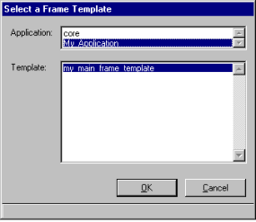
The Select a Frame Template dialog appears.
3. Select an application and a template from the Application and Template list fields, respectively (for example, My_Application and my_main_frame_template):
4. Click OK.
OpenROAD does the following:
• Overwrites the current style sheet (including any field styles you may have created) with the frame template style sheet
• In the Style Editor, displays the style sheet from the template in place of the frame's original style sheet
• Modifies all fields on the form to conform to the field styles on the new style sheet
To read a style sheet from an external file
1. Open the Style Editor.
2. Click File, Read Style from File.
A standard File Selection dialog appears.
3. Locate and select the file to be loaded into the Style Editor.
4. Click Open.
The style sheet is associated with the current frame.
Delete Field Styles
You can delete field styles in the Style Editor.
To delete one or more field styles
1. Open the Style Editor by clicking Tools, Style Sheet on the Frame Editor's floating menu bar
2. Select the field style to be deleted in the Style Editor.
3. Click Edit, Delete Field Style.
4. Repeat the previous steps to delete other styles.
Note: You must leave at least one field style or model for each field type, which will become the default style for the field type.
5. Click File, Close to exit the Style Editor.
You are returned to the Frame Editor.